Start outside the obvious subject
We tend to look where the camera looked: straight at the thing we wanted. Try another pass. Begin at the top left, travel around the perimeter and only then enter the centre. A bright scrap of sky, half a hand or a dark shape can redirect a picture before the main subject gets a word in.
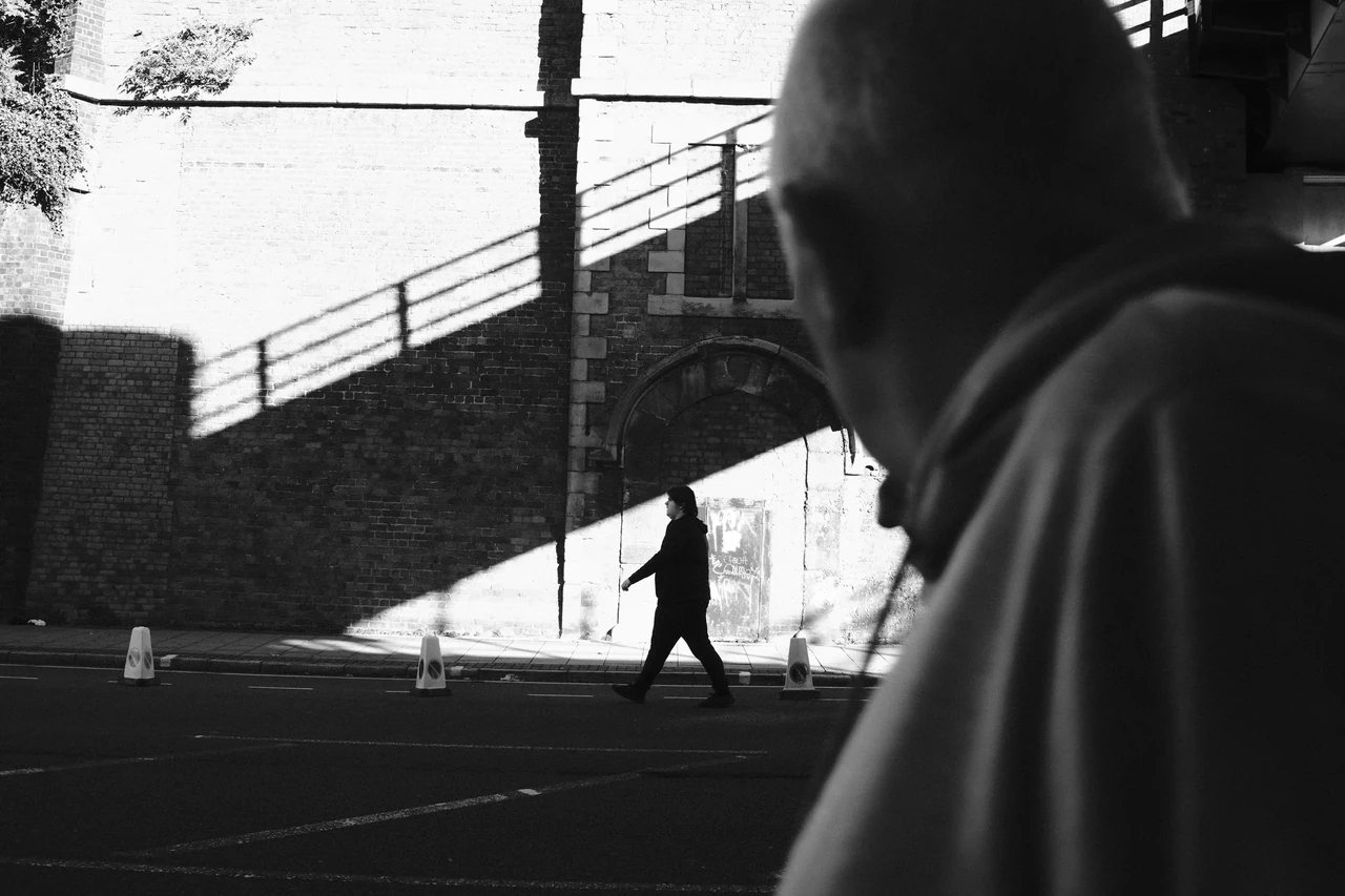
An edge is not automatically untidy because something crosses it. Cutting into a foreground body can make the space feel close and occupied. A clean margin can create distance. The question is whether the interruption contributes or merely happened while you were admiring the middle.
A loose line above a hard edge
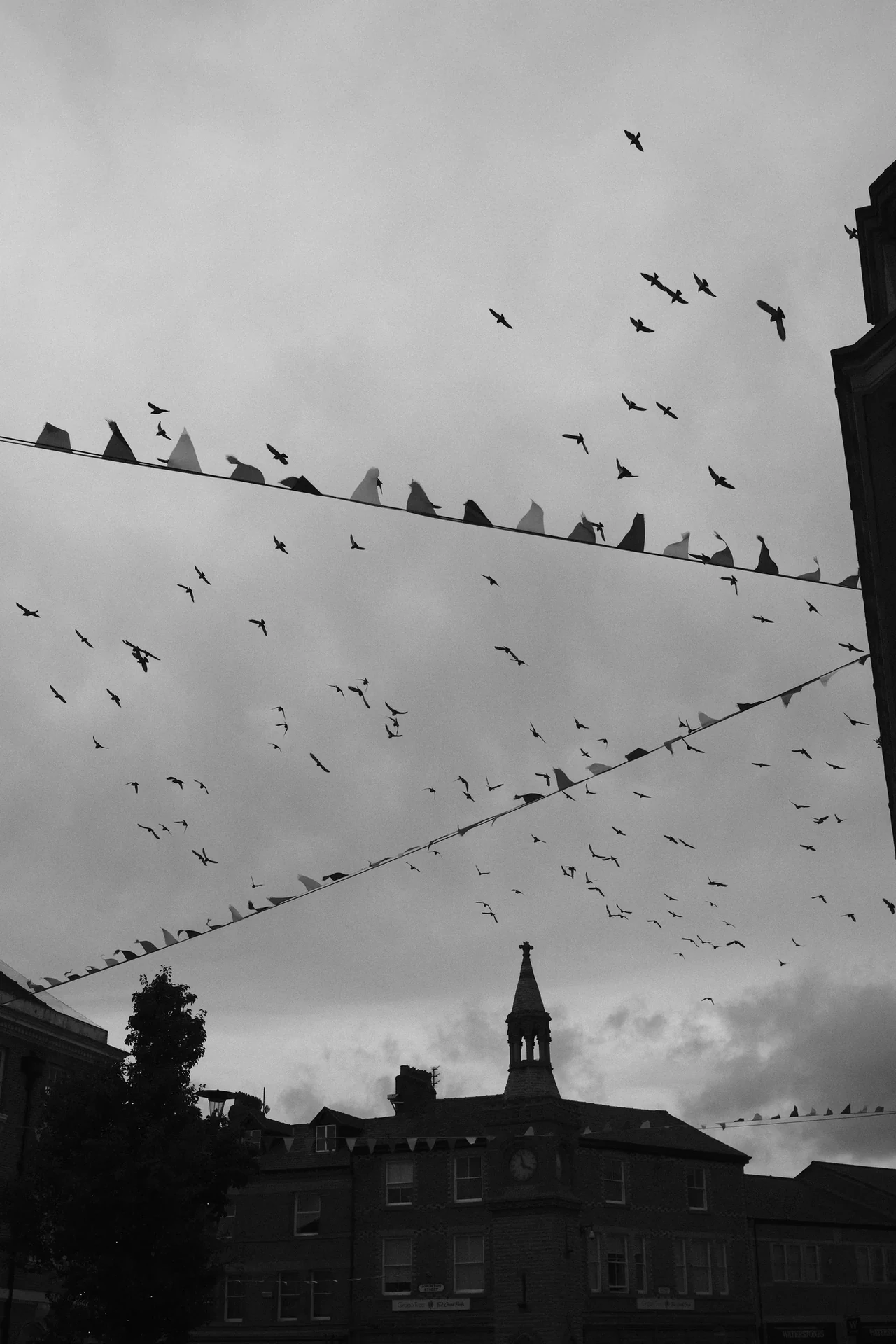
Bunting, birds and the roofline make different sorts of marks against the sky. The architecture is solid; the birds are irregular and temporary. Follow that change in rhythm across the frame. Empty sky gives the small shapes room to be seen.
Birds above the Bunting · Photograph © Mark C GrantCompare three different kinds of boundary
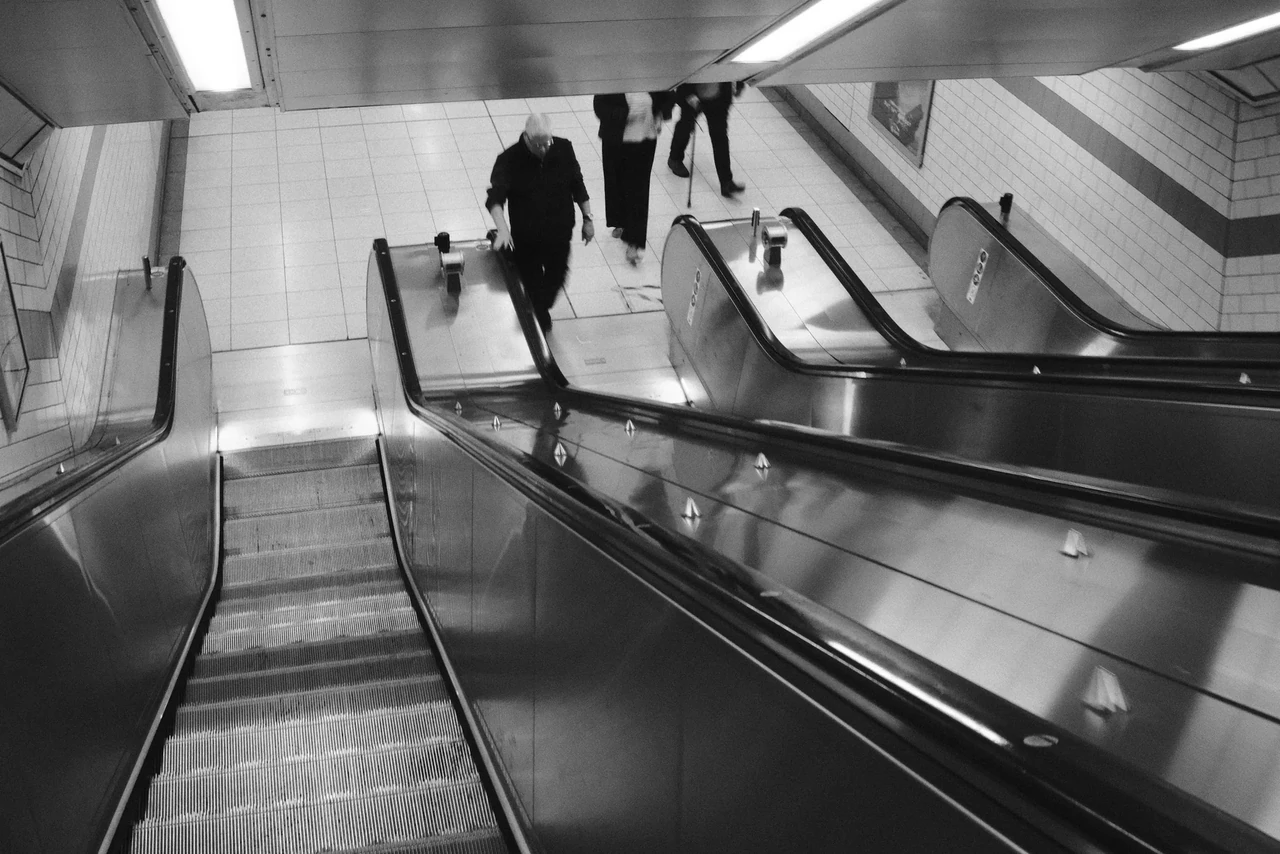
In Passing through the Frame, the near figure creates a large interruption and makes the smaller figure beyond feel farther away. In Birds above the Bunting, the roofline gives the scattered birds a firm lower boundary. In Descending the Escalators, rails enter and leave the picture, leading the eye through a space that plainly continues beyond it.
These are different uses of the edge: obstruction, support and direction. None requires a tidy border on every side. Try describing the job before deciding whether to crop. “It looks cleaner” is a start, but clean is not the only available ambition.
Follow the rails
The diagonal rails give the eye several routes through the frame. Small figures make those routes legible as movement through a building, not just a pattern. Trace one diagonal to its end, then notice how another brings you back. A picture can be busy and still have an order.
Descending the Escalators · Photograph © Mark C GrantA crop is a change of argument
If you remove the large foreground passer-by, the distant figure becomes easier to read. You also lose the collision of distances. If you remove too much sky above the bunting, the birds have less room to scatter. A crop can improve one quality while destroying another.
Keep the full frame alongside any experiment. Compare both at the same display size and give each a sentence: this version is about proximity; that one is about a solitary figure. The better version is the one that serves your intention, not the one that most resembles a composition diagram.
Practical guidance from Captured Moment. Starting points to test in your own work, not universal camera settings.
Take this to the discussion.
A question, an example, a picture that proves us wrong. Specific beats loud.
Open the conversation ↗