More than a dark patch
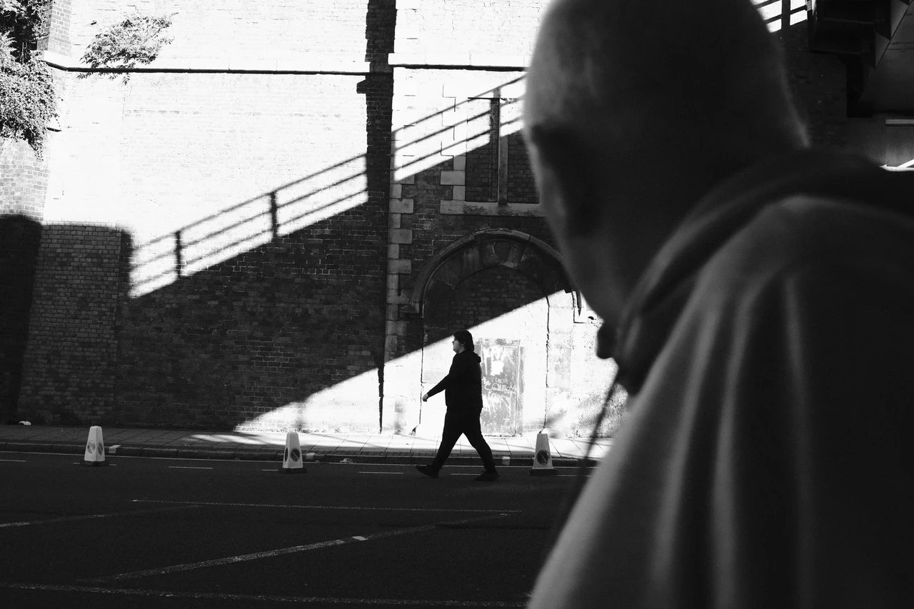
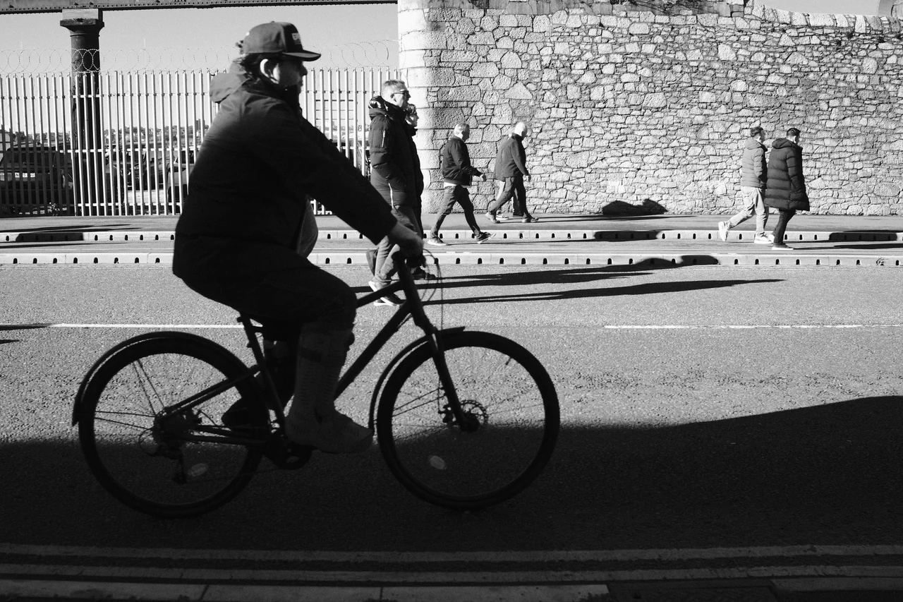
A shadow can make a small figure occupy a large amount of space. It may point somewhere, repeat a gesture or link a person to an otherwise empty part of the pavement. Once you notice that, you stop treating it as something attached to the subject and start composing both together.
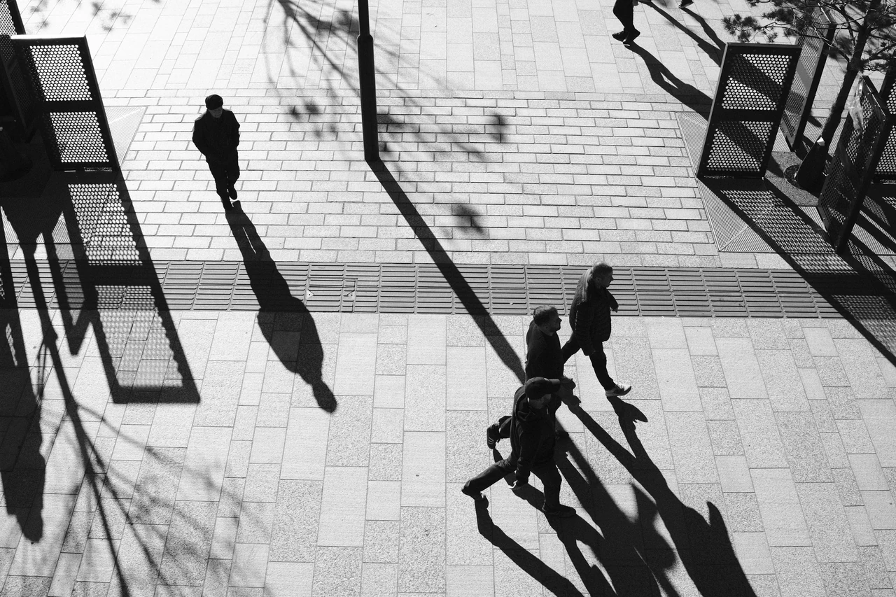
Look at Crossing into Sunlight. The figure and its extension form one relationship across the light ground. Now look at Long Shadows on the Concourse: several people and shadows draw a more complicated pattern across the paving. The same light behaviour produces a different kind of picture.
One step changes the picture
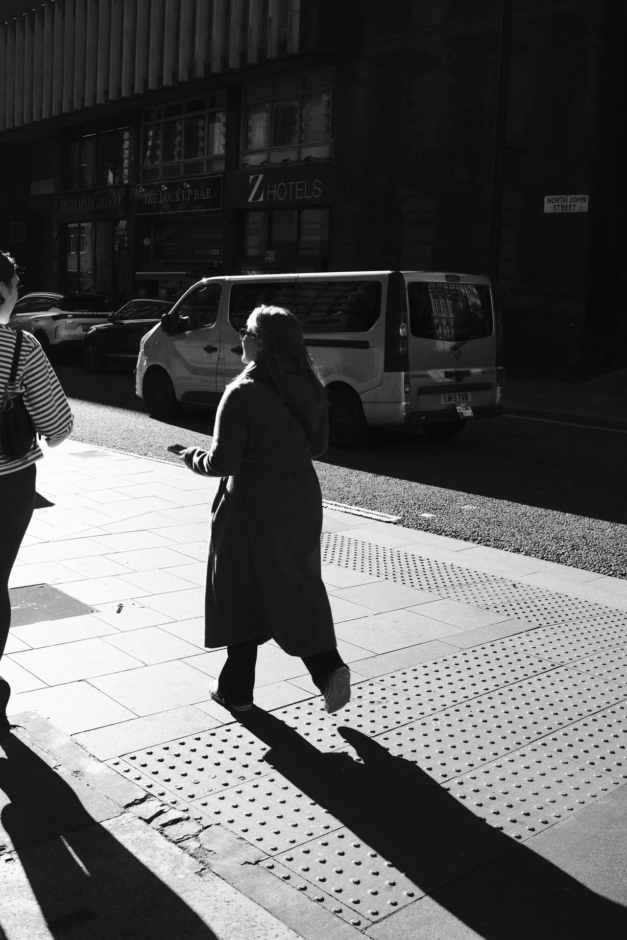
A figure crosses a sharply divided patch of pavement, with a long shadow extending across it. Light makes the pedestrian and the ground separate clearly. Follow the shadow towards the edge. It is part of the composition, not an accessory to the person.
Crossing into Sunlight · Photograph © Mark C GrantCheck the point of contact
Follow each shadow back to the feet. That join helps the viewer read what belongs to whom. Where the dark shape crosses another figure, a railing or the edge of the shade, the reading can become less immediate. Sometimes the ambiguity is useful; sometimes it is merely a tangle.
Do not watch only the person entering the frame. Watch where their shadow is going to land. The moment you want may happen before the person reaches the place you first chose. A pavement can be a remarkably complicated stage for somewhere with chewing gum on it.
The pavement gets a second cast
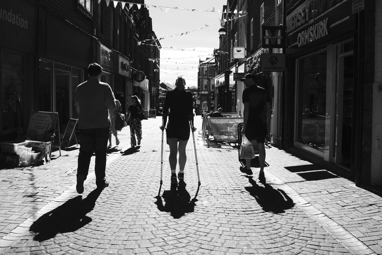
People occupy one part of the street while their shadows reach into another. Follow the dark extensions rather than looking immediately at faces. The low light makes ordinary walking gestures larger. Ask where a shadow begins to overlap another shape and becomes harder to read.
Shadows along Burscough Street · Photograph © Mark C GrantAvoid the automatic contrast response
The shadow needs to separate from its surroundings, but that does not mean the whole photograph needs maximum contrast. Notice what remains visible in the lighter paving and surrounding architecture. Those quieter tones give the darkest shapes something to work against.
Make one edit that preserves more middle tones and another that simplifies the image harder. Compare the relationships at a small size. Keep the version in which the eye can follow the shadow’s job most clearly, rather than the one with the most dramatic histogram.
Practical guidance from Captured Moment. Starting points to test in your own work, not universal camera settings.
Take this to the discussion.
A question, an example, a picture that proves us wrong. Specific beats loud.
Open the conversation ↗