A photograph is not promoted to art by removing the blue
Black and white can turn a familiar street into a strange arrangement of weights: a bright face, a black coat, the pale slice of pavement between two bodies. It can also turn a dull photograph into a dull photograph with excellent taste in stationery. Colour has not been the problem in every disappointing frame since 1839.
The useful question is what the picture needs us to notice. A red sleeve can connect a person to a sign across the road. Remove the red and that relationship may vanish. Conversely, three unrelated bright signs can compete with the tiny movement of a hand. Without their hues, the gesture may become the centre of the picture. These are changes in meaning and attention, not a contest between serious photographers and people who have discovered the saturation slider.
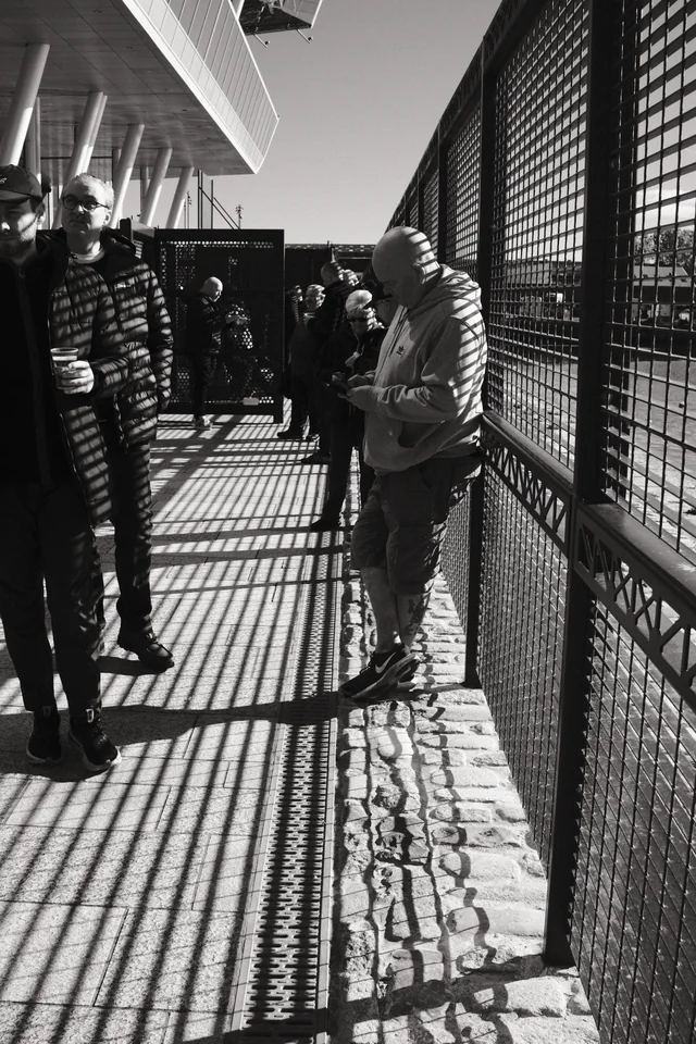
Begin with Mark’s Between the Railings. The mesh and its projected shadow make two grids: one standing, one falling across the walkway and the people. Bodies interrupt the pattern without escaping it. B&W puts striped clothing, fence, cobbles and sunlight into a shared tonal language. The people remain people, rather than convenient marks supplied by the geometry department.
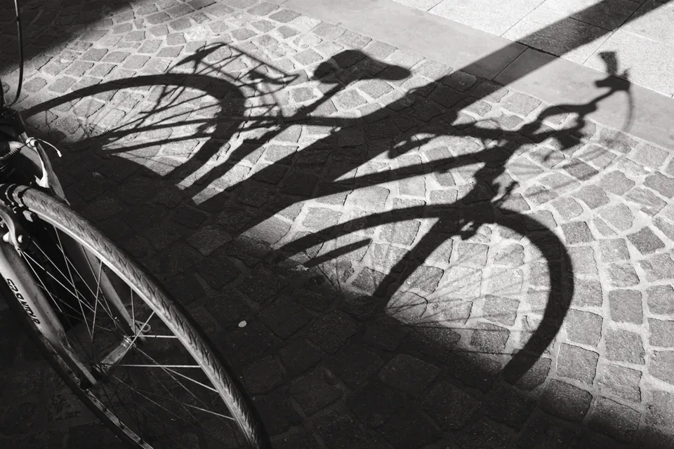
Bicycle Shadows
The wheels repeat, but the shadows stretch the rhythm. Follow where the bicycle ends and its projection begins.
Photograph © Mark C Grant · Photograph page ↗Colour can be the structure, not the decoration
Look at Blue Shopfronts below. The blue shopfronts form a band across the building; red signs and warm brick make smaller counterweights. There is already a composition before anyone obligingly walks into it. Calling those colours distractions would be rather like asking a band to remove the bass because it keeps making a noise.
William Eggleston is the useful interruption to monochrome smugness. His 1976 MoMA exhibition and William Eggleston’s Guide helped change colour’s standing within art photography. This was not the invention of colour photography, nor the first time a museum had seen it. MoMA’s contemporary announcement argued that colour helped define the content of the pictures. That distinction still matters: colour is doing work, not applying a coat of excitement afterwards.
Watch the Tate film below and stop on a photograph with a strong coloured area. Describe where your eye travels before naming the subject. Then ask which relationship would disappear if hue disappeared. Do not recolour somebody else’s artwork and present it as their alternative version. Study the actual work. A photographer’s decisions deserve more attention than our preferred preset.
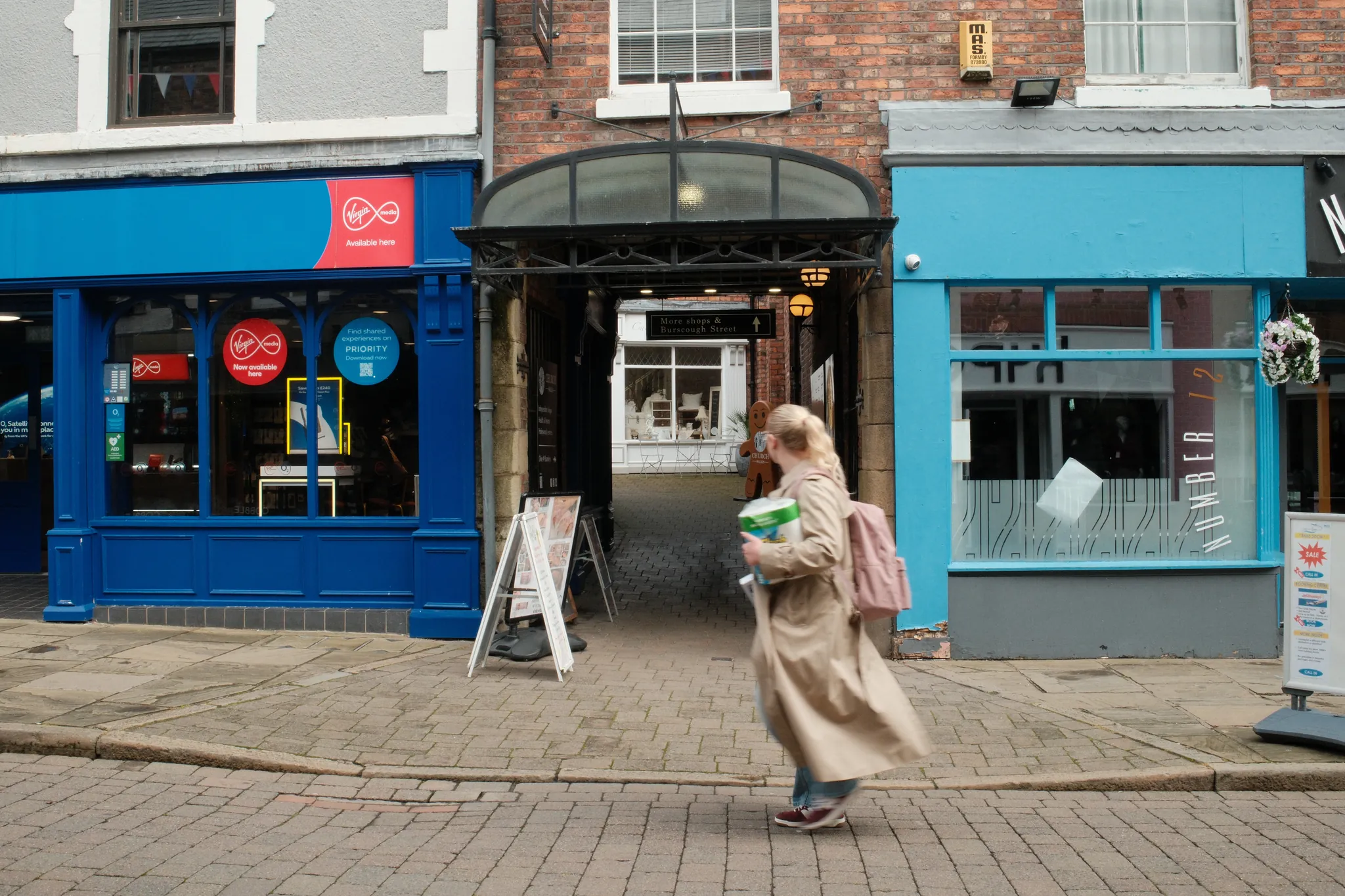
Blue Shopfronts
Original colour photograph © Mark C Grant. A separate photograph for discussing colour relationships; not a paired conversion or a sensor comparison.
Original catalogue entry ↗Source notes: MoMA: William Eggleston, artist and exhibition history ↗ · MoMA: original 1976 Eggleston exhibition announcement ↗.
Watch, then try
William Eggleston | TateShots

Stop on a colour photograph. Identify two coloured areas that organise the frame. Explain what their relationship contributes before naming the subject.
B&W changes the grammar of a room
In The Window and the Bottle, Egg Cafe, the window is both a light source and a grid. Its pale panes occupy most of the picture; the narrow bottle-shaped silhouette sits low against them. The eye travels through divisions before finding the small dark shape. There is a view outside, but the photograph does not hand us an easy escape into it.
This is one reason monochrome can feel close to memory. It removes one familiar description of the world and lets intervals, edges and tonal masses carry more of the burden. That is a reading, not a neurological law. Colour can be intensely remembered too: a school jumper, a kitchen wall, the particular orange of a streetlight. Nostalgia has never signed an exclusive contract with grey.
Nor does B&W automatically simplify. Look at Bicycle Shadows: spokes, paving joints, wheels and overlapping dark shapes make a busy argument. Removing hue can strengthen a pattern, but it can also merge objects that colour kept separate. The task is not fewer things at any cost. It is a useful relationship between the things left in the frame.
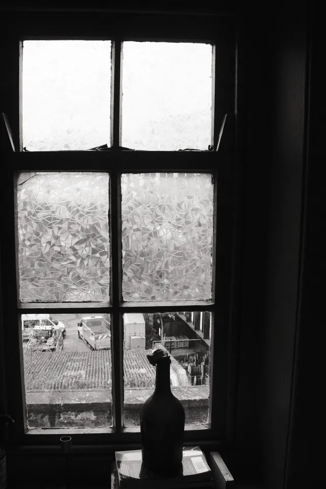
The Window and the Bottle, Egg Cafe
The Window and the Bottle, Egg Cafe: divided light above, a small silhouette below. Open the complete frame.
Photograph © Mark C Grant · Photograph page ↗Three routes to a monochrome picture
First, a colour-sensor RAW file converted later. You retain colour-dependent measurements and can choose how different hues become tones. A blue coat and a red door may be separated differently by different conversions. This is interpretation, just as paper, filtration and printing decisions shaped a darkroom photograph. It is not cheating merely because the decisions take place near a kettle and a computer.
Second, a colour camera making a B&W JPEG in-camera. Fujifilm’s ACROS and its simulated yellow, red and green filters are examples. The sensor still records through a colour filter array; the camera renders those measurements into a monochrome result. The JPEG carries that rendering. Keeping RAW alongside it preserves the possibility of another conversion: Fujifilm’s X100VI playback menu explicitly offers film simulation and white-balance choices when making copies from RAW.
Third, a dedicated monochrome sensor, such as those in the Leica M11 Monochrom or Pentax K-3 Mark III Monochrome. These omit the colour filter mosaic used by ordinary colour cameras. There is no captured colour separation to retrieve later. That is a physical difference in acquisition. JPEG-only is a working rule; a monochrome sensor is a hardware constraint. Both can help a practice, but they are not the same commitment.
Where is the choice made?
- Colour RAW → B&W later
- Colour-dependent data retained. Tonal interpretation can change after capture.
- ACROS JPEG on a colour camera
- Rendering committed in the JPEG. A separately saved RAW can still be reinterpreted.
- Dedicated monochrome RAW
- No colour mosaic data to recover. Exposure, spectral filtration and later tonal processing still matter.
Source notes: Fujifilm: X100VI image quality and film simulation ↗ · Fujifilm: X100VI RAW conversion ↗.
What the sensor actually measures
A typical Bayer colour sensor places red-, green- and blue-selective filters over neighbouring photosites. Each photosite measures a signal through its filter, rather than independently recording a complete RGB triplet. Demosaicing estimates the missing colour components using the surrounding samples. Fujifilm’s X-Trans uses a different mosaic arrangement; it still uses colour-selective filters. The little Bayer diagram here is a teaching model, not an X-Trans map.
Remove that mosaic and each photosite can respond across a broader band of wavelengths allowed by the sensor and its remaining optics. You avoid colour demosaicing and the light loss caused by those colour-selective filters. That can improve fine-detail rendition and sensitivity compared with a suitably comparable colour design. Ricoh’s monochrome design notes describe this direct correspondence between sensor samples and image pixels.
It does not mean a monochrome pixel measures human perception directly. Its response depends on wavelength, illumination and the sensor’s spectral sensitivity. Nor does removing colour filters mean removing every filter: Leica specifies a UV/IR filter in the M11 Monochrom. Monochrome is not another word for infrared, and a black-and-white RAW file still needs interpretation to become the picture on your screen.
Colour mosaic
4 positions
Selective filters
Monochrome
4 positions
Broader response
Source notes: Basler: Bayer sampling, pilot camera manual, chapter 10 ↗ · Ricoh: Pentax K-3 Mark III Monochrome sensor design ↗ · Leica: M11 Monochrom technical specification ↗.
More light, yes. Three times the photograph, no
There is a real engineering advantage to collecting light without throwing some of it away in a colour mosaic. There is also a sizeable internet industry devoted to turning that advantage into a universal magic number. A 24-megapixel monochrome sensor does not acquire 72 million spatial sampling locations because it stopped making colour. The number of sites has not tripled.
How much detail survives depends on the lens, focus, aperture, motion, subject pattern and processing as well as the sensor. A monochrome design avoids colour interpolation artefacts, but fine repeating structures can still alias: sampling is still sampling. Compare equal-size outputs as well as pixel views. Otherwise a different enlargement can masquerade as a different quality of seeing.
Sensitivity, noise and dynamic range are related, but not interchangeable. EMVA’s camera-characterisation standard distinguishes signal-to-noise, saturation and the sensitivity threshold; dynamic range compares the saturation limit with that threshold. Removing a filter can help photon collection without guaranteeing that every monochrome camera beats every colour camera in usable highlight-to-shadow range. Sensor generation, pixel size, electronics and exposure still matter.
There is no controlled sensor comparison in Mark’s photographs on this page. They illustrate visual decisions. A compressed web image cannot isolate a sensor advantage from different lenses, exposures, sharpening or JPEG curves. For an actual comparison, photograph the same stationary scene under the same light, record the settings, match framing and output size, and disclose processing. Then look at prints. The photograph is allowed to be larger than a forum argument.
Source notes: Basler: camera selection and colour versus monochrome ↗ · EMVA 1288: sensitivity, signal-to-noise and dynamic range, release 4.0 Linear ↗.
Highlights: the white bit is not a storage cupboard
If a monochrome RAW sample reaches saturation, it contains no recoverable measurement of how much brighter that part of the scene was. A colour RAW file may sometimes retain information in a less-exposed channel when another channel clips; that is limited reconstruction, not a promise. A monochrome file has no separate colour channel to fall back on. Do not confuse a dramatic white JPEG with proof that the RAW data has clipped, either: rendering and capture are different stages.
For a bright street, identify which highlights actually matter: a face, a pale coat, a cloud you want to describe. Meter and test for those; use your camera’s highlight warning and understand that a JPEG histogram reflects its rendering. There is no universal minus-one-stop commandment. Bright specular glints may reasonably go white while a face needs its gradation.
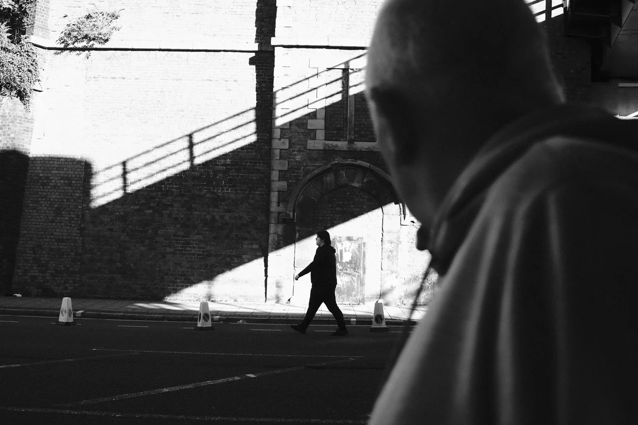
Conversation in the Glare is a useful visual counterpoint. The light breaks into the meeting between three figures and interrupts a clean account of their faces. Our reading concerns the glare’s effect on the encounter, not a claim that clipped RAW data has been recovered or that the photograph demonstrates monochrome-sensor performance. Sometimes the interruption belongs in the picture. Sometimes it merely hides the thing you meant to show. Keep enough judgment to tell the difference.
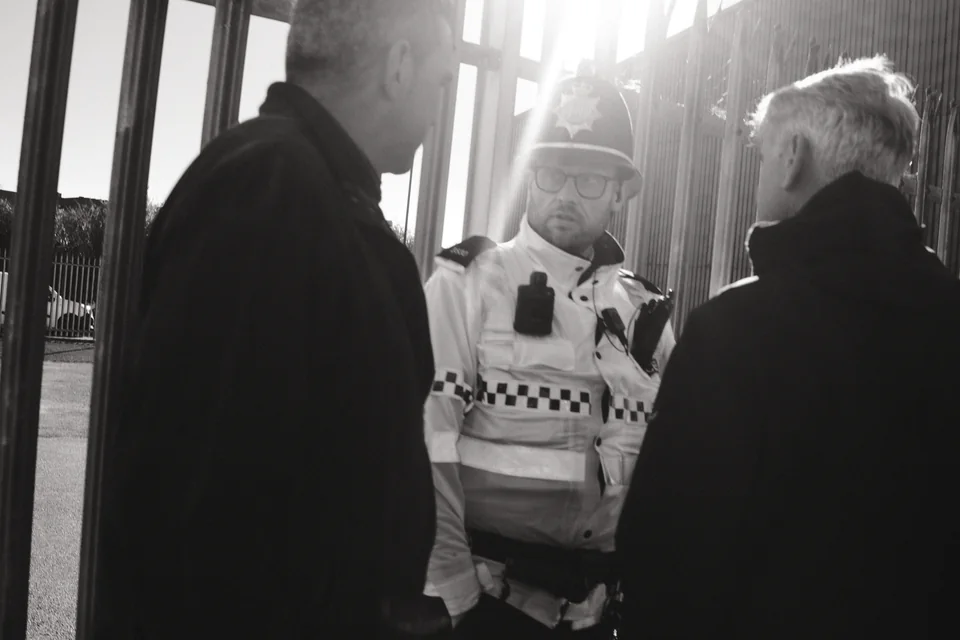
Conversation in the Glare
Glare becomes part of the encounter. This is an editorial reading of Mark’s photograph, not a sensor test.
Photograph © Mark C Grant · Photograph page ↗The colour decision comes back through the lens
Once colours have collapsed into the same monochrome value, a red slider cannot know which grey object used to be red. With colour RAW you can weight colour channels in conversion. With a dedicated monochrome capture, changing relative spectral transmission means making the choice before exposure—for example with a physical coloured filter.
A red filter transmits relatively more red light than blue and can darken a blue sky relative to red subjects. Its effect depends on the scene and illumination; it also costs light. Check exposure, movement and the camera’s metering response rather than borrowing a fixed compensation from a different filter. Changing the available light is not identical to reweighting a saved RGB file.
This is not just a bag of accessories from 1974. Ricoh’s GR IV Monochrome incorporates a switchable red filter in its lens unit, replacing the ordinary GR IV’s ND filter. Fujifilm’s ACROS+R, by contrast, is a rendering option on a colour-sensor camera. Similar intent, different point in the chain. One changes which light reaches capture; the other changes how colour measurements become grey.
Source notes: Ricoh: GR IV Monochrome and its physical red filter ↗.
An optical finder does not turn monochrome
The M11 Monochrom is a rangefinder; the Pentax example is a DSLR. Sensor design does not dictate how you focus or compose. An optical rangefinder still shows the coloured world through its finder even when the sensor records monochrome. An electronic view can preview a B&W rendering. They ask for different habits of translation, and neither arrangement issues a certificate of street credibility.
For a colour camera, a B&W preview can make a useful training ground. Watch whether a person separates from the wall behind them. Shift your position or wait for different light when they do not. Then take the picture without cycling through fourteen simulations while the subject walks to another postcode. The preview should sharpen attention, not become the afternoon’s main activity.
The psychological value of a dedicated camera may be decisive for one photographer and irrelevant for another. Fewer options can settle a practice. They can also simply be fewer options. Before paying for a permanent constraint, spend a month making and keeping one consistent B&W output. Judge what the photographs gained, rather than how convincingly the camera advertised your intentions.
Sharpness is a resource. It is not the subject
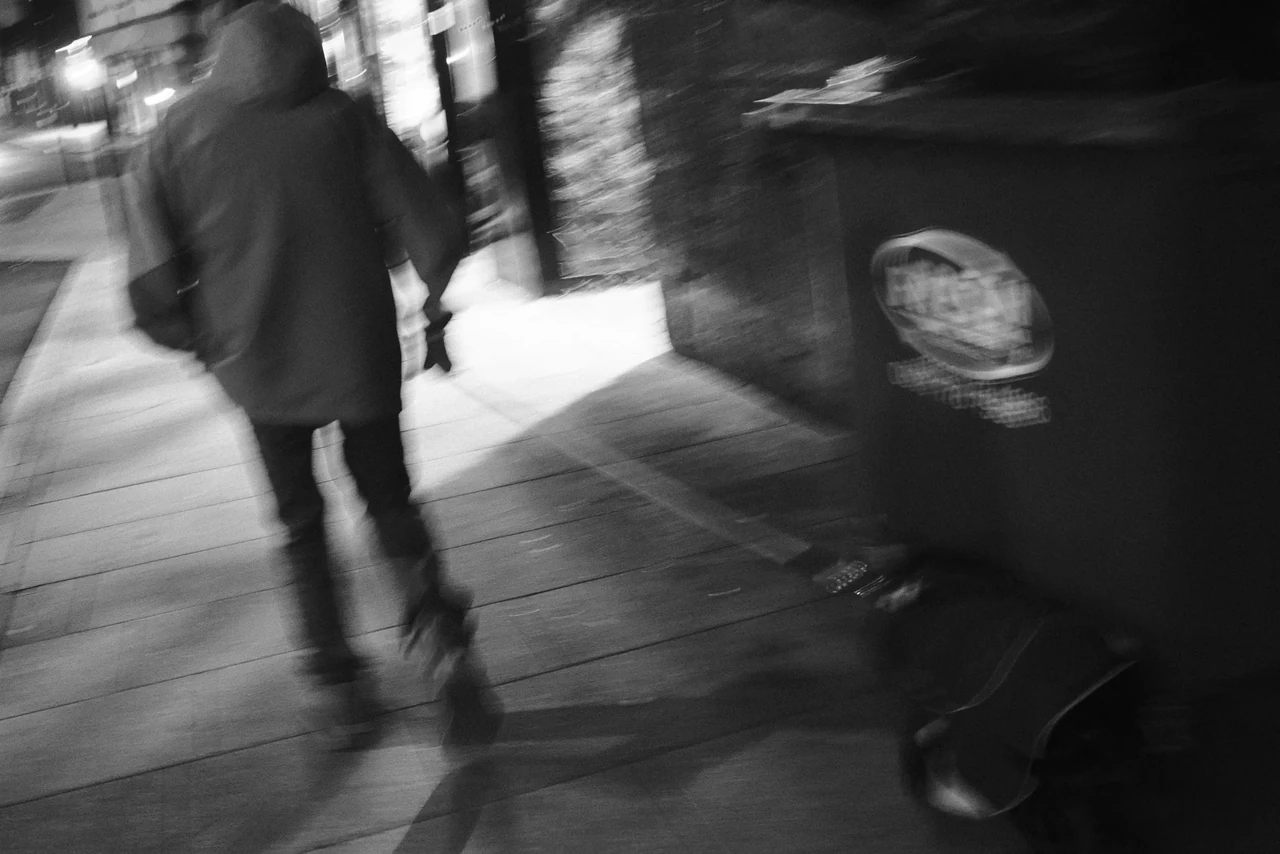
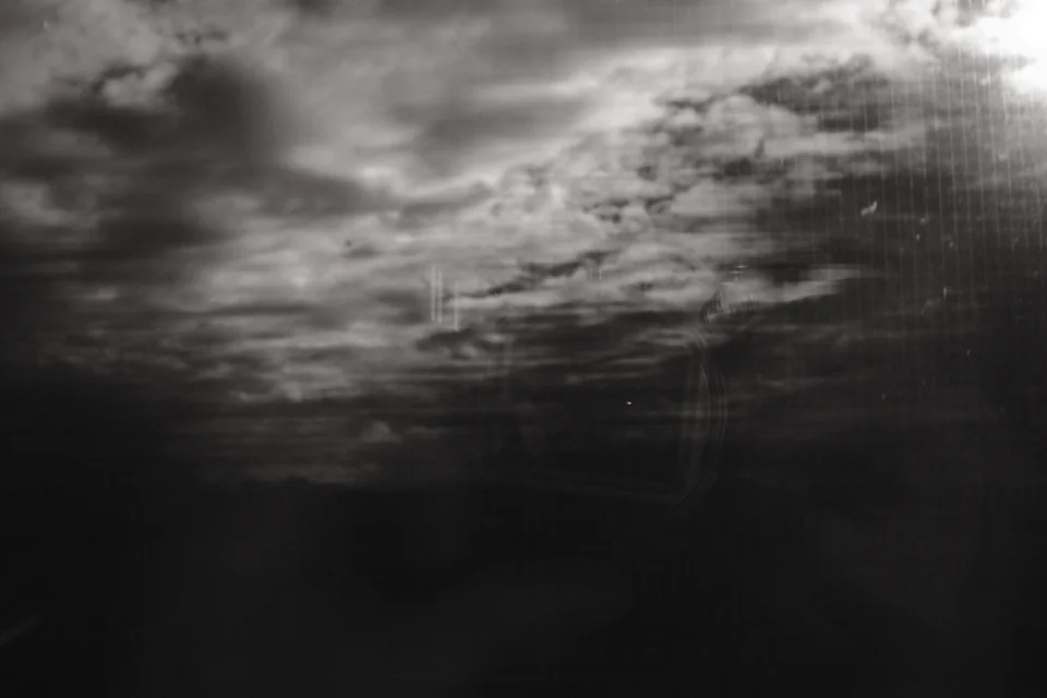
Passing Bus holds two times together: the road’s marks sit relatively still while the bus stretches across them. Bridge in Passing trades a stable inventory of a bridge for rails, streaks and patches of sky. Landscape through Glass adds reflection and the photographer’s own looking to the landscape. More resolving power would not tell these pictures what to mean.
That does not make technique the enemy. Reliable exposure and focus let you choose where to depart from description. A soft face can be tender, disturbing or simply missed. A leaning frame can carry urgency or merely need a better decision. Imperfection becomes interesting when it changes the experience, not when it provides an all-purpose excuse.
The useful freedom is to recognise a picture that exceeds the original test. Mark describes Landscape through Glass as exactly that: testing slow shutter on a train and getting something more. Keep the failed-looking frames long enough to ask whether their rhythms, interruptions or uncertainty contain the point. Then edit firmly. A contact sheet can be generous without becoming a witness-protection programme for every exposure.
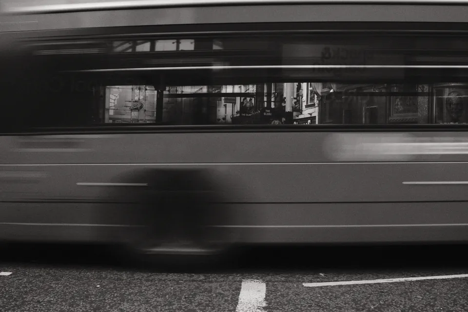
Passing Bus
A relatively still road beneath a moving band: look for the difference between blur carrying the subject and blur hiding it.
Photograph © Mark C Grant · Photograph page ↗Twelve frames. Two ways of paying attention
Walk one short route twice with the same camera and focal length. On the first pass make six pictures whose reason is colour: an echo across a street, warm against cool, a lone saturated object, a colour that locates the place. On the second make six whose reason is tone: silhouette, separation, a reflection, texture, a repeated dark shape, a transition into light. Use a fixed B&W rendering for that second pass.
Keep the initial JPEGs unchanged for the first edit. RAW+JPEG is fine if you want a separate learning exercise afterwards; retain the untouched twelve. This is an attention experiment, not a controlled sensor test, because time, subjects and your decisions change between walks. If you only have a monochrome camera, make a written colour observation on the first pass and twelve tonal photographs on the second. You do not need to buy another camera to participate.
Tomorrow, choose two from each pass at the same display size. Name the relationship each depends on. Which colour picture loses its meaning in your imagined monochrome version? Which B&W frame merges a subject into its background? Which technically untidy frame still has life? Make a four-picture sequence, then remove one. The strongest argument for your choice should be visible in the photographs. Your camera’s badge gets no vote.
Download the twelve-frame field card ↓
Watch, then try
Film Simulation - ACROS Promotional Video/ FUJIFILM

A manufacturer’s promotional film, not a recipe tutorial. Compare the bright edges, middle greys and dark areas. Choose a tonal direction for your own twelve frames; the photographs here do not promise the same result from one setting.
Watch, then try
The new Leica M11 Monochrom rangefinder camera.

Nick Rains introduces the M11 Monochrom for Leica. Separate the manufacturer’s demonstration from a controlled comparison. List one sensor benefit and one decision the photographer still has to make.
Sources & further looking
Facts checked 23 October 2026. The practical exercises and critical readings are this publication’s editorial interpretation.
- MoMA: William Eggleston, artist and exhibition history ↗
- MoMA: original 1976 Eggleston exhibition announcement ↗
- Fujifilm: X100VI image quality and film simulation ↗
- Fujifilm: X100VI RAW conversion ↗
- Basler: camera selection and colour versus monochrome ↗
- Basler: Bayer sampling, pilot camera manual, chapter 10 ↗
- Ricoh: Pentax K-3 Mark III Monochrome sensor design ↗
- Leica: M11 Monochrom technical specification ↗
- EMVA 1288: sensitivity, signal-to-noise and dynamic range, release 4.0 Linear ↗
- Ricoh: GR IV Monochrome and its physical red filter ↗
Take this to the discussion.
A question, an example, a picture that proves us wrong. Specific beats loud.
Open the conversation ↗