Before the recipe, a way of looking
A Saul Leiter Fujifilm recipe is a useful invitation to go outside. It becomes less useful when we expect a menu setting to organise the street. A softened palette can change the relationship between colours already in a photograph. It cannot put a passing face in the right gap, invent the reflection you walked past, or persuade an inconvenient canopy to become a composition. Those are still your department.
Leiter (1923–2013) moved to New York in 1946. Painting remained central to his life; the Foundation’s biography describes an artist whose curiosity ranged widely across art and whose photographs grew alongside painting. The point is not that his pictures vaguely resemble paintings. Look for particular decisions: a large dark plane, a small passage of colour, several distances pressed together, a subject partly withheld.
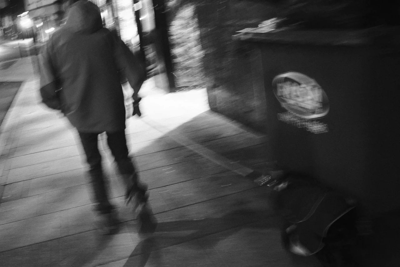
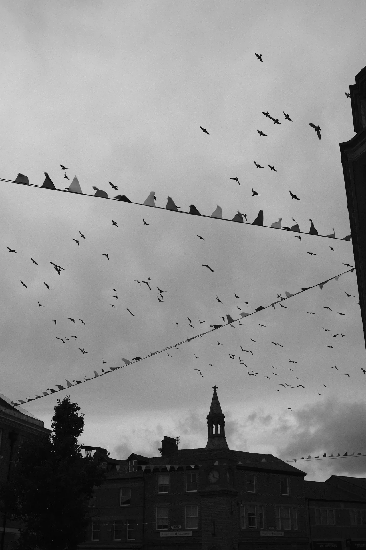
This is a colour excursion from a journal with a B&W centre of gravity. It belongs here because both approaches ask what to separate and what to let merge. We will examine one actual Leiter photograph, then compare three photographs by Mark C Grant. The comparisons are editorial observations, not claims that Mark copied Leiter. Our camera recipe is a proposed starting point for your own tests; the separate Studio preset works on an existing picture. Neither is Leiter’s own setting.
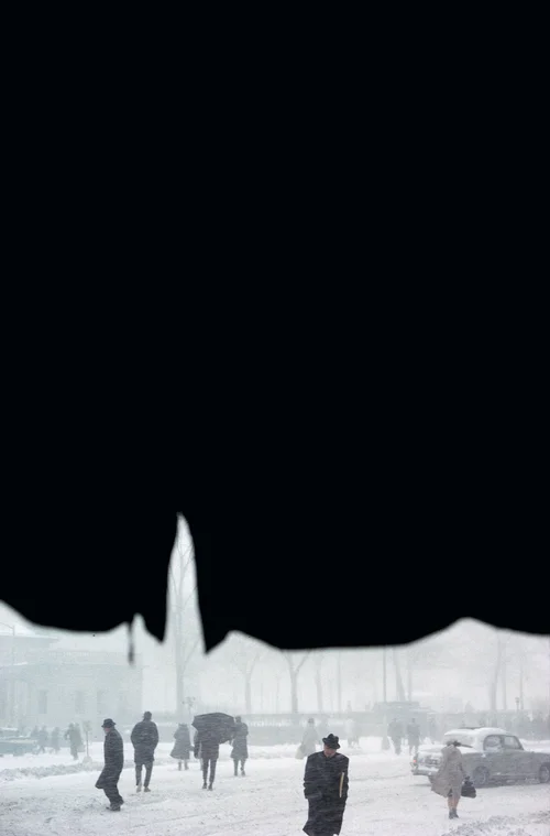
Canopy, 1958: the obstruction is doing the work
First, allow the enormous dark shape to stay enormous. In Canopy, the upper part of the vertical frame is almost entirely occupied by the near-black covering. Beneath its uneven, scalloped edge, a narrow portion of street becomes visible. The light opening rises to a point left of centre, then lowers again. Before we identify a single person, that edge has already made a route for the eye.
The people are compressed into the bottom of the frame: hats, shoulders, overlapping bodies, an umbrella further in. A dark-coated figure in a black hat approaches near the lower centre-right; further right, a pale coat stands apart. Another dark figure crosses at the left. A car occupies the street beyond. Pale weather and distance reduce the far buildings to suggestions. We can recognise a city encounter without receiving a complete description of the city.
The canopy is close and comparatively definite; the street recedes through softened layers. That difference gives the picture depth even while the dark mass makes it feel graphic and flat. The frame keeps switching between a shaped surface and a place we might enter. Remove the upper darkness and you have a more conventional street view. You also lose the pressure that makes the small visible world matter. A tidy crop could be a very efficient way to ruin it.
Notice how little colour has to announce itself here. There is no compulsory red umbrella acting as an emergency exit for the eye. The cool, subdued street and the slight distinctions between coats do their quieter work beneath the dominant black. A colour photograph can operate near the edge of monochrome. Muted colour is a relationship within a particular frame, not a command to turn every channel down by the same amount.
Watch, then try
In No Great Hurry : 13 Lessons in Life with Saul Leiter TRAILER

A trailer, not the complete film: watch how looking, painting and everyday surroundings are introduced. Which detail would you linger over? Then read Canopy closely and take one question to an ordinary window.
A gap is different from a gimmick
Return to the outline of the canopy and ask where you would put a person if you were waiting there. The bright gap could frame a head, but the photograph is richer than a single perfectly isolated silhouette. The figures overlap and occupy different distances. Some of what happens remains obscured. That partial access is part of the experience of looking from one place at a street full of other lives.
We cannot recover Leiter’s shutter speed, exposure decision or private intention from this reproduction. What we can assess is the result: a large obstruction, a small inhabited opening and an atmosphere that makes distant detail uncertain. It is a useful distinction when discussing a famous photograph. Looking closely is evidence; confidently guessing a lens is a pub game.
Take this question to the Foundation’s colour gallery as well. Compare the placement of obstructions in Through Boards (1957) with the treatment of a vehicle and its surrounding space in Taxi (1957). Open the official works rather than relying on a collection of vaguely vintage thumbnails. Ask how much of the view is withheld, and whether the remaining fragments are enough to hold your attention. You are studying decisions, not collecting a shopping list of umbrellas.
Explore Canopy, Through Boards and Taxi at the Foundation ↗ · About the complete film, In No Great Hurry ↗
Mark’s window: inside and outside refuse to queue
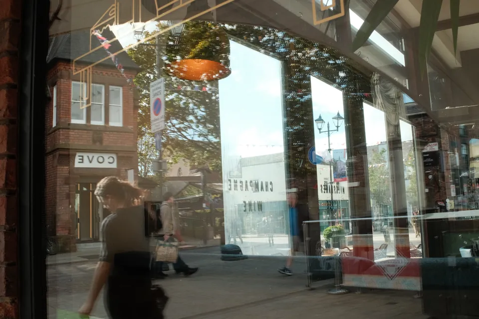
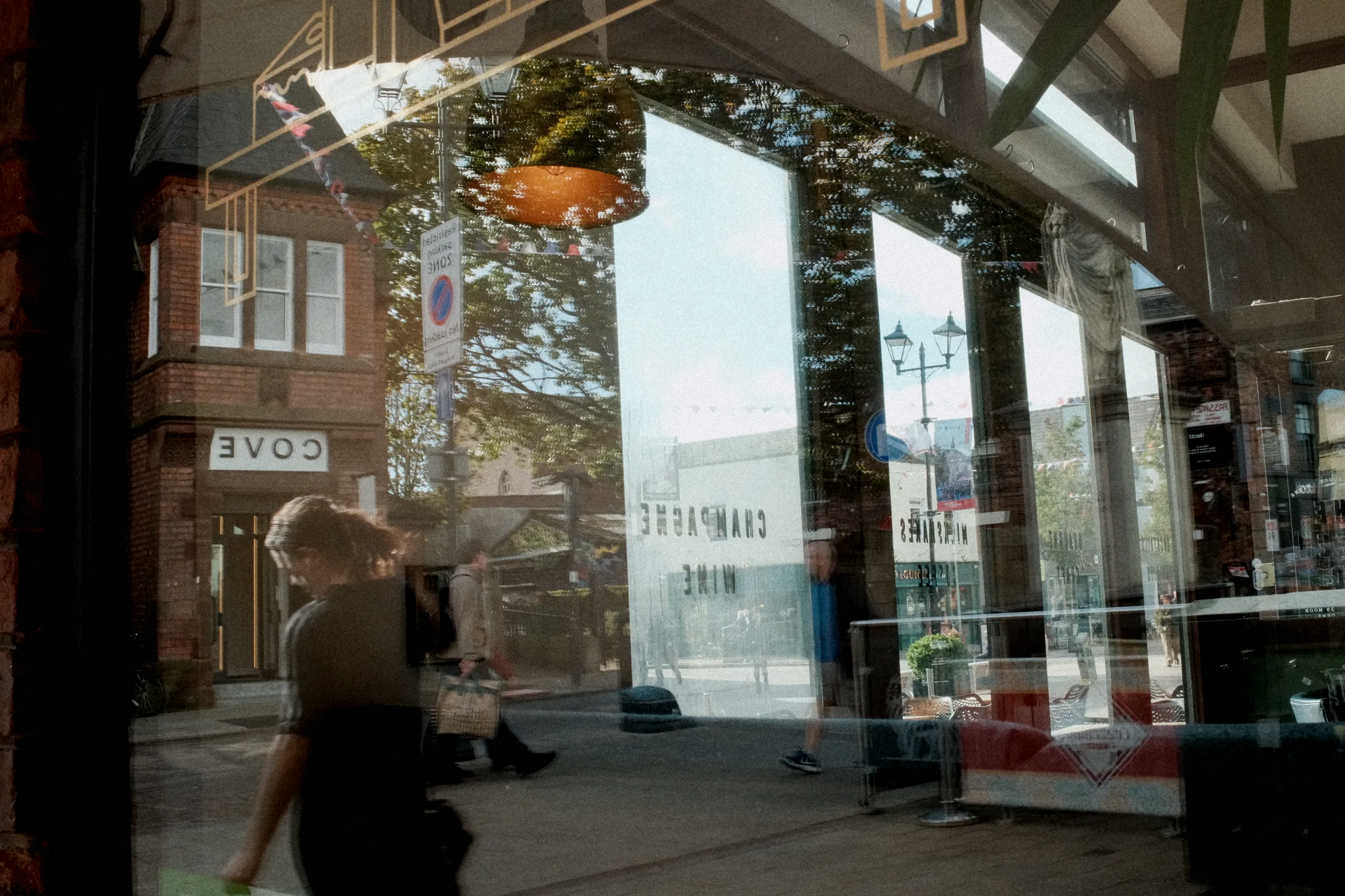
Return to Reflections in the Shop Window at the top of this page. The orange underside of a hanging shade sits among reflected foliage. Window frames and pale panes divide the picture, while a brick building, lettering and pedestrians occupy overlapping layers. The nearer dark-clothed person at the lower left does not politely separate from everything behind them. The glass makes the street and the interior share a surface.
The orange shape is a small warm interruption among cooler greens, pale glass and brown brick. It gives the eye somewhere to return without needing to dominate the whole photograph. Several frames within the frame offer different versions of depth. At one moment you read the pane as a flat pale rectangle; at another you read the space beyond it. That oscillation is more interesting than simply announcing that reflections are artistic.
This is Mark’s original colour photograph, selected from his studio catalogue, with its existing rendering intact. The original was not made to demonstrate the recipe below. Later in this article, a labelled before-and-after shows what the Studio preset does to a copy. Its useful connection to this Leiter study is the layered view and the distribution of colour. The picture has its own place, people and decisions. It deserves to remain itself rather than being dressed up as New York in 1958.
Quiet colour needs something to be quiet about
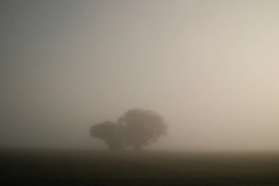
Field in the Fog makes a different comparison. The tree mass sits low in a large, pale field of atmosphere. The left side feels cooler and darker; the right opens into a faint warm glow. Ground and foliage remain distinguishable, but their edges are soft. Colour is present as a gradual change across the image rather than as several brightly labelled objects.
That is why indiscriminate desaturation can miss the point. If we remove too much, the subtle warm-to-cool relationship disappears. If we increase contrast to rescue every branch, the fog becomes an inconvenience we have corrected out of the picture. Start by asking what the weather is doing. Some days it is supplying the most interesting part of the photograph for free.
A foggy field is not a Leiter street photograph. The comparison concerns how little information a picture can offer while still feeling particular. Make the distinction, then let the example widen your practice. A shop window, a bus shelter and a field do not need to resemble one another before they can teach you about atmosphere.
Glass is an active ingredient
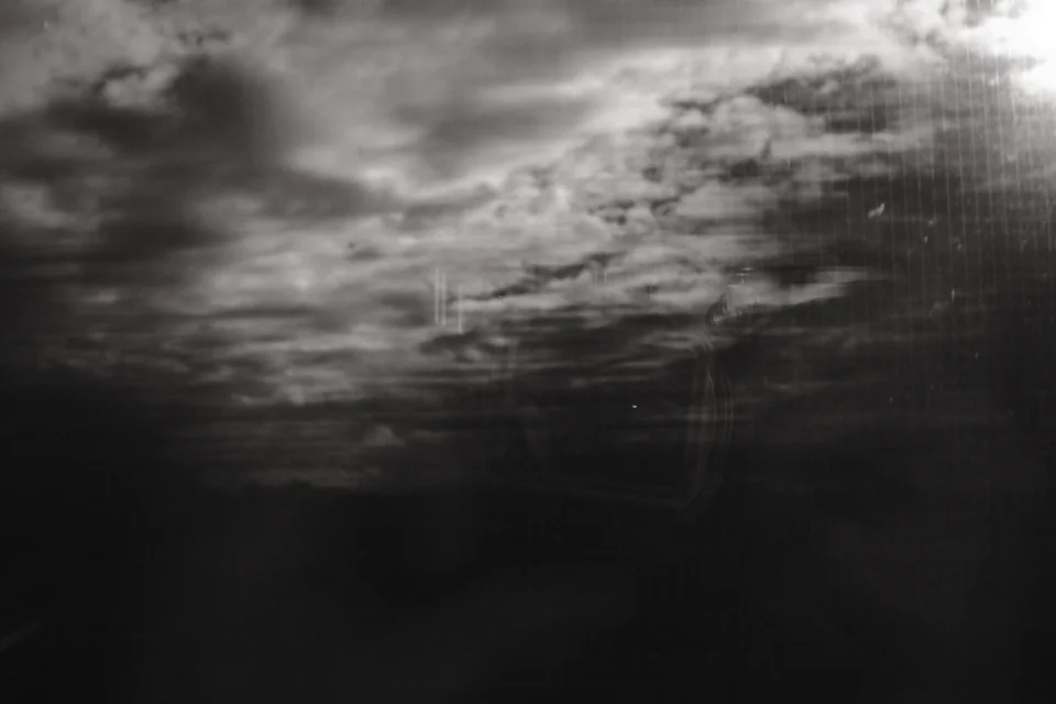
In Landscape through Glass, Mark’s slow-shutter train experiment joins movement outside to reflections inside. Nearby land, trees and fencing move across the view more quickly than distant features. The window carries a reflected camera, hands, lens, eyes and spectacles: several kinds of glass, several acts of looking. His own account connects the result with childhood, memory, decay and a fading dream.
That account belongs to Mark; it is not a meaning we have borrowed from Leiter. The useful shared question is what happens when the surface between camera and world becomes visible. You can focus on a reflection, on the world beyond, or let one soften the other. Change your angle a little and the relationship can change substantially. A polarising filter that removes a reflection might remove precisely what you came to photograph.
For this exercise, work from somewhere you are allowed to stand, with permission inside a café or shop when needed. Keep away from kerbs and platform edges while concentrating on the finder. You need an ordinary window and time to notice it. Liverpool is not short of glass, weather or people trying to get past someone standing in the way.
Rain glass: a Fujifilm starting point to test
The camera settings below are our proposed restrained-colour starting point for the X100VI and bodies offering the same controls. They have not been field-tested for this article, and none of the photographs shown is a camera sample made with them. Treat the table as a test brief, not a verified reconstruction of Leiter’s film or a promise of matching these pictures. Older bodies may omit controls or render the same values differently.
Classic Chrome supplies the subdued base. A modest shadow adjustment gives darker shapes some weight; softer highlights leave room for pale windows and overcast sky. Keep the grain weak enough that you still notice the subject first. A fixed daylight balance makes comparisons easier within one walk, but it is not suitable for every light. Under mixed artificial lighting, make a test and adjust the white balance before committing to your twelve frames.
On the X100VI, DR200 needs ISO 250 or higher. Switch D Range Priority off to control the tone curve and dynamic range yourself. Start exposure compensation at zero and check the important highlights; do not automatically darken every picture because an artist’s name is on the exercise. Save the settings in a custom bank and check which settings your particular body recalls. Fujifilm’s manual and recipe guide are linked below.
There are also established independent interpretations worth exploring. Marcel Fraij’s Urban Vibe uses Classic Negative; Ritchie Roesch’s Summer of ’59 uses Eterna and is explicitly inspired by selected Leiter photographs. They make different choices. Follow their original pages for the complete recipes, compatible bodies and their own examples. A photographer’s work can sustain several readings; one numeric formula cannot stand in for an entire career.
Rain glass / proposed camera test
Original Captured Moment starting point. Not field-tested; not Leiter’s settings.
| Control | Starting value |
|---|---|
| Film simulation | Classic Chrome |
| Dynamic range / priority | DR200 / D Range Priority Off |
| Tone curve | Highlight −1 / Shadow +1 |
| Colour | −1 |
| White balance | Daylight; shift R +1, B −1 |
| Grain | Weak / Small |
| Colour Chrome / FX Blue | Weak / Off |
| Sharpness / High ISO NR | −2 / −2 |
| Clarity | 0 |
| Image quality / colour space | Fine JPEG (or Fine + RAW) / sRGB |
| ISO / exposure | X100VI: ISO 250 minimum for DR200; choose ISO and shutter for the scene. Start compensation at 0, then meter and test. |
Tried it? Show us what happened.
Bring a photograph, your camera and settings, and one thing you learned. A useful experiment is welcome, even when the result surprised you.
Marcel Fraij’s Urban Vibe recipe ↗ · Ritchie Roesch’s Summer of ’59 recipe ↗
Try the idea in Studio
Rain glass · Leiter-inspired is now a starting point in our Studio editor. It reduces saturation modestly, restrains highlights, adds a little contrast and fine grain, and nudges the balance cooler. It works on the colour already present in your JPEG, PNG or WebP. It is not Fujifilm Classic Chrome, a camera profile, or a Kodachrome simulation. The camera table and the browser preset use different controls and will not produce matching files.
Open your own colour photograph, apply Rain glass, then compare the original tones. Ask whether the small colour relationship you cared about still survives. If the scene was already subdued, back off saturation reduction or grain. If the important face vanishes, open the shadows. A recipe should be easy to disagree with. Otherwise it is merely a very small tyrant with a pleasant name.
Save your version with a name that describes the light or the decision. Export its recipe file if you want to keep a portable copy. The editor’s discussion sharing can pair the original and edited tones at the same crop, alongside a recipe others can try. Add a sentence saying what you changed and why. Please use your own photograph, not the Leiter reproduction above.
Download the Studio recipe ↓ · Open the editor and your own photo ↗
Your photograph. Our Studio. Your decisions.
Don’t have a Fujifilm camera?
You can still try this look. Open a JPEG, PNG or WebP from any camera in our free browser editor, apply Rain glass, and make it yours. No new camera required. The editing happens on your device.
View both full frames
Before · original colour
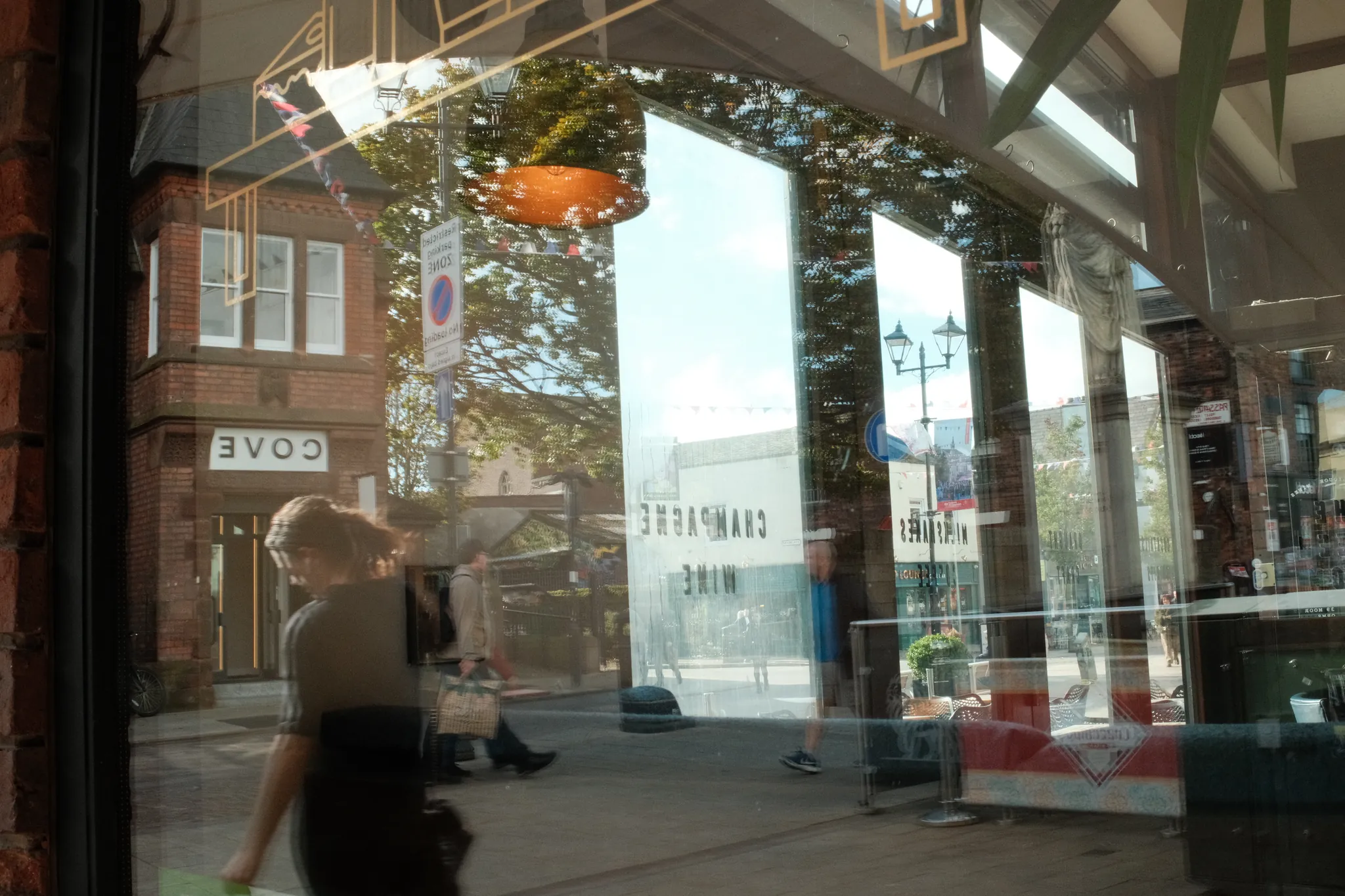
After · Rain glass
Reflections in the Shop Window · Photograph © Mark C Grant. Original studio photograph ↗
Watch the pale window reflections become more restrained, the darker frames gain weight and the orange lampshade lose a little intensity. Fine grain adds texture. The people, reflections and framing stay exactly where they were.
This is the actual Rain glass · Leiter-inspired Studio preset applied to Mark’s existing colour file, with no crop or extra adjustments. It demonstrates our browser treatment, not the Fujifilm camera recipe or the photographer’s own settings. Drag the comparison to judge the changes, or open View both full frames to enlarge either photograph.
Try Rain glass on your photo →
Open your photograph, then press Apply recipe. Tweak the result, save your own variation, and use Share before & after in Discussion to show us what happened. Tell us what you changed and what you learned. A useful miss is welcome too.
Twelve frames: what happens if you show less?
Choose one short walk, one focal length and a consistent colour rendering. Allow forty minutes and twelve single exposures. Make a couple of setup tests first if you are trying unfamiliar camera settings; then freeze the look for the twelve-frame exercise. Adjust focus, shutter speed and exposure as the scene requires. No burst fishing, no deleting misses, no later crop or tonal rescue for this first edit.
Frames one to four: an open view. Establish a place and look for one relationship between colours. Frames five to eight: put something real close to the lens or between you and the scene—a window edge, a doorway or an awning. Move until the obstruction contributes. Frames nine to twelve: work with reflection or softened distance. If the weather is clear, glass will do; do not manufacture a rain effect afterwards to satisfy the brief.
Tomorrow, make a contact sheet of all twelve full frames. Select three: one with a strong colour relationship, one where withholding information helps, and one miss that explains a better decision. Put the miss beside the selected picture rather than quietly binning the evidence. Write a short factual caption and a separate sentence about your interpretation.
Review without defending yourself: where does the eye enter, which edge holds it, and what becomes less clear? Is the colour essential, or merely pleasant? Does the obstruction create a relationship, or hide a weak subject? Would the photograph still hold you if nobody mentioned Leiter? That last question is the useful one. The recipe may have got you out of the house. Bring back something you saw.
Download the twelve-frame field card ↓
Watch, then try
Fujifilm Film Simulations Settings Simplified (Part 3) | Assign Custom Settings
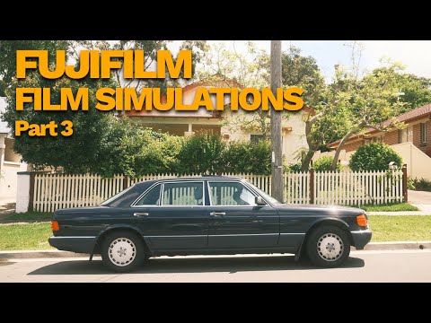
An independent walkthrough of assigning custom settings. Follow the saving process, then check your own model’s manual: menus and the settings stored in a bank vary. Name one saved bank before starting your twelve exposures.
Sources & further looking
Facts checked 26 October 2026. The practical exercises and critical readings are this publication’s editorial interpretation.
- Saul Leiter Foundation: biography ↗
- Saul Leiter Foundation: colour photographs, including Canopy (1958) ↗
- Saul Leiter Foundation: In No Great Hurry ↗
- Fujifilm: make your own film simulation recipe ↗
- Fujifilm X100VI manual: image quality settings ↗
- Marcel Fraij: Urban Vibe / Saul Leiter recipe ↗
- Ritchie Roesch: Summer of ’59, a fifth-generation Fujifilm recipe ↗
- Saul Leiter Foundation: reproduction policy ↗
Take this to the discussion.
A question, an example, a picture that proves us wrong. Specific beats loud.
Open the conversation ↗